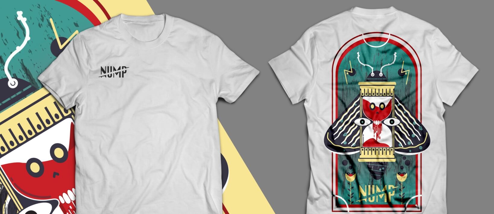
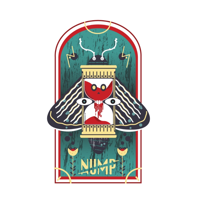
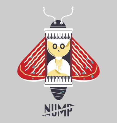
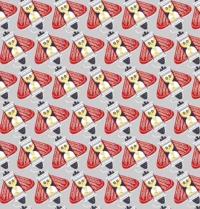
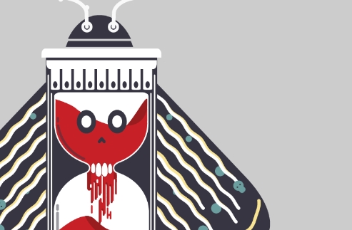
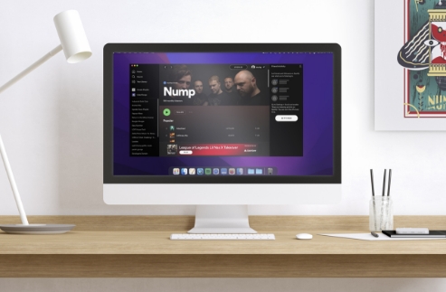
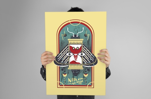
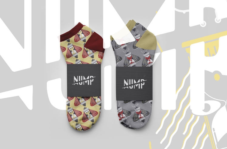
When we started to ideate and develop Nump's illustration, we wanted it to be both versatile and how it could apply to other items outside of apparel: posters, stickers, etc. We created subtle elements within the illustration that could lead to patterns.
After building the illustration, the next was to create a font for the band name, which was a fun challenge due to the other typeface not relating to the curves of the moth. This typeface we chose is a nice contrast against the illustration and complimented the design.
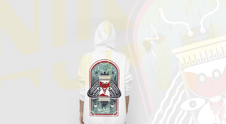
Next, we applied the designs of t-shirts, posters, socks, etc. Important to note: the design elements were used on large applications to small patterning pieces.
We're a huge fan of the front badge pocket on t-shirts with a large impact graphic on the back. This adds value to the design as well rounded appearance, by not cheapening it by only applying it as a front-facing graphic.
