Home » Case Studies New » Hi House Case Study B.

Design Detail:
Delivery Service

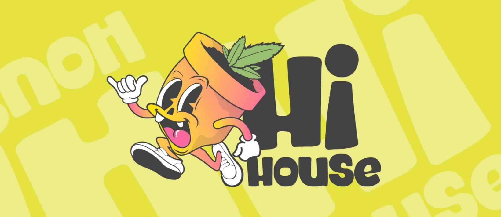
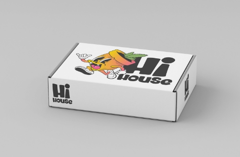
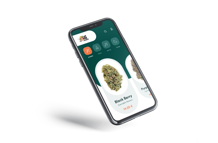
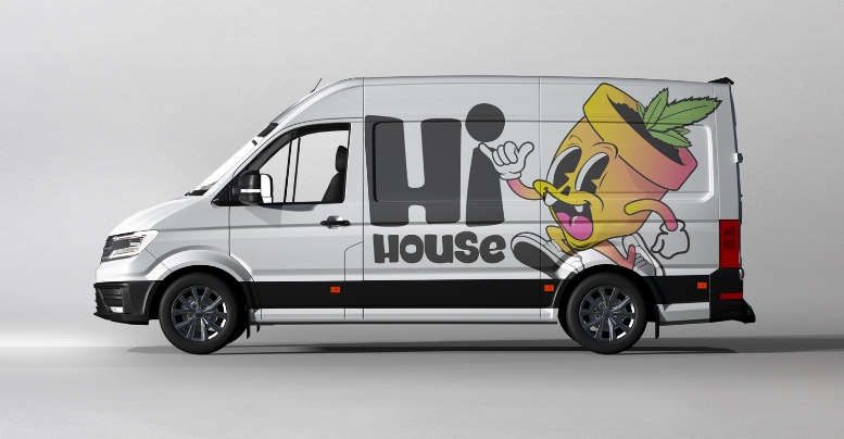
Introducing HI House, a California-based weed delivery company. Centered around the bright, cheerful vibe of 1920s cartoon characters. Below you’ll find the story of the project creation, from early sketches to the finished product.
This was an amazing client project let us flex our skills at custom illustrations. The excitiment on this project was so fun. Yet so mellow. 
Hi House

Discovery & Strategy

With main competitors like Weed Maps who aim to be the amazon version of delivery, we wanted to set HI House apart from the basic crowd. We thought the brand persona should match that vibe of a retro delivery person with a modern twist.

The main drive is the brand name, though it does not contain a "house image". The font was meant to capture that "melody times cartoon" tone. Where the customer would feel a sense of positive childhood recall.

The colors were just another piece of the design to make everything cohesive. So our intent was to create a color palette that stuck out in the online cannabis industry.
Hi House

Design & Exploration

We started the development of various characters that were centered around color, charm and connection. The final character brings a sense of goofiness and chill vibes.

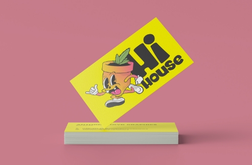
With further ideation of merch, the character could be featured on the back of a shirt with the company name on the front. The HI House stack type can be a stand alone for smaller applications if needed.
Hi House

Cutting Edge
Cannabis Designs

This branding we created showcases the cutting edge designs within the cannabis delivery business, and we’re proud of that. Logo branding is a fun way to experiment, stretch our skills, and test possible formats and different logo applications we can use on other projects.