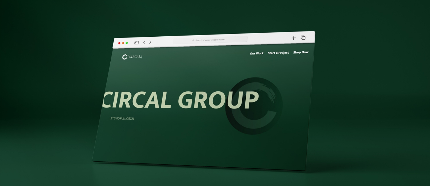
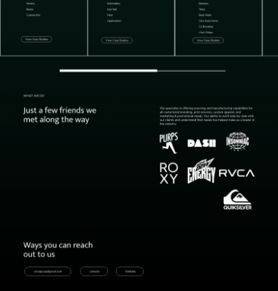
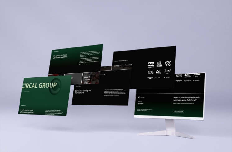
After meeting with the Creative Director at Circal Group, we knew the type of brand we were working with simple and dark and let the photograph pieces do the talking. We started in Adobe XD, and laid out pieces of a conversation. The assets they sent did the heavy lifting for us. We needed to use their images to make sense with a cohesive color palette.
The wireframe was a walk in the park, next we needed to prioritize design style and create a case study around it. All while yielding the right amount of image-to-text balance.
For this client, we advised them to move out of the realm of paid fonts and go with Adobe fonts, since it offers a large typography library.


