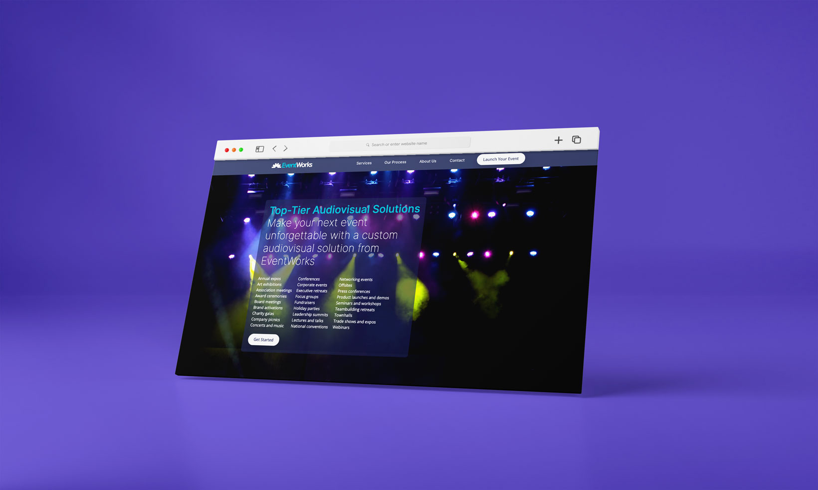
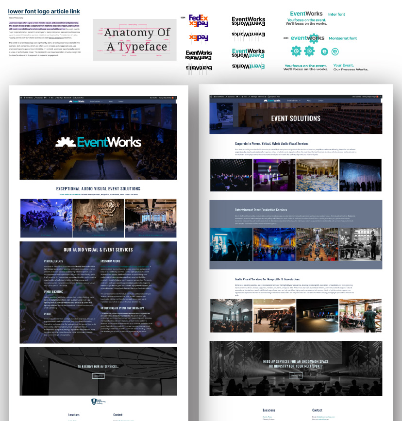
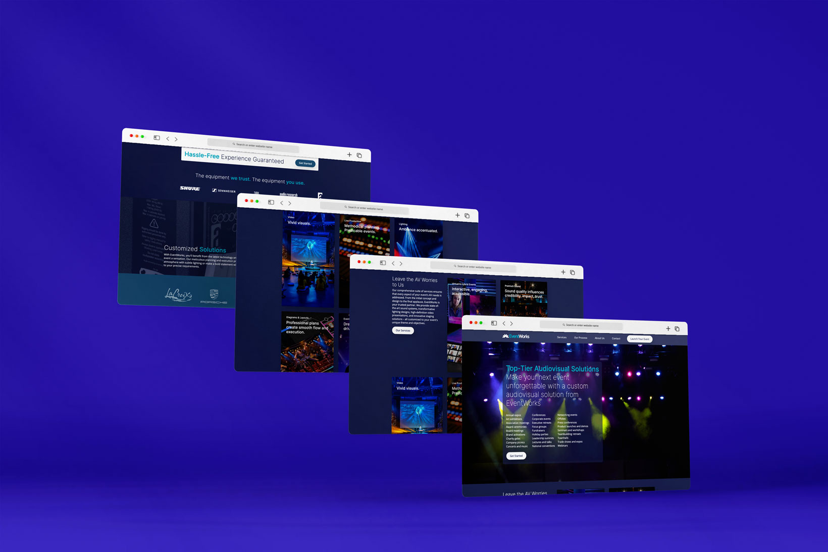
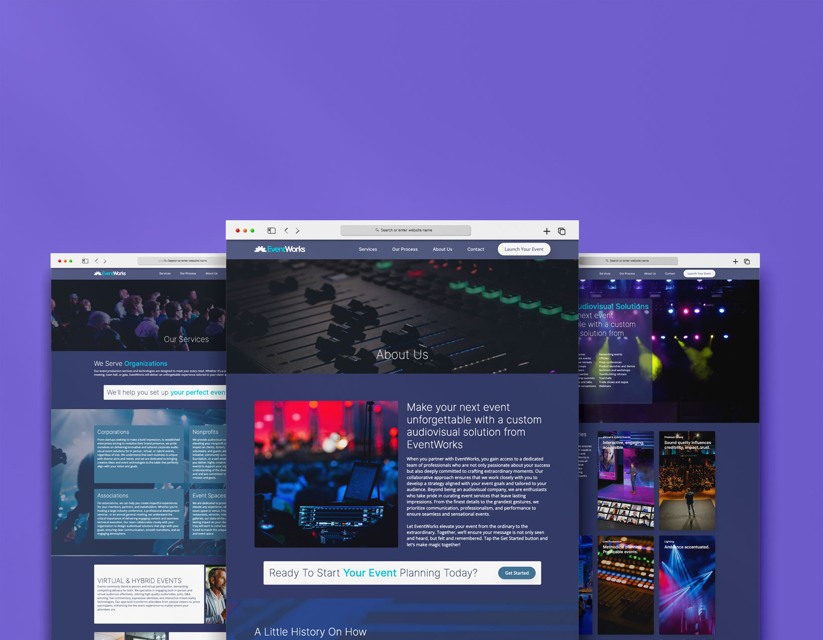
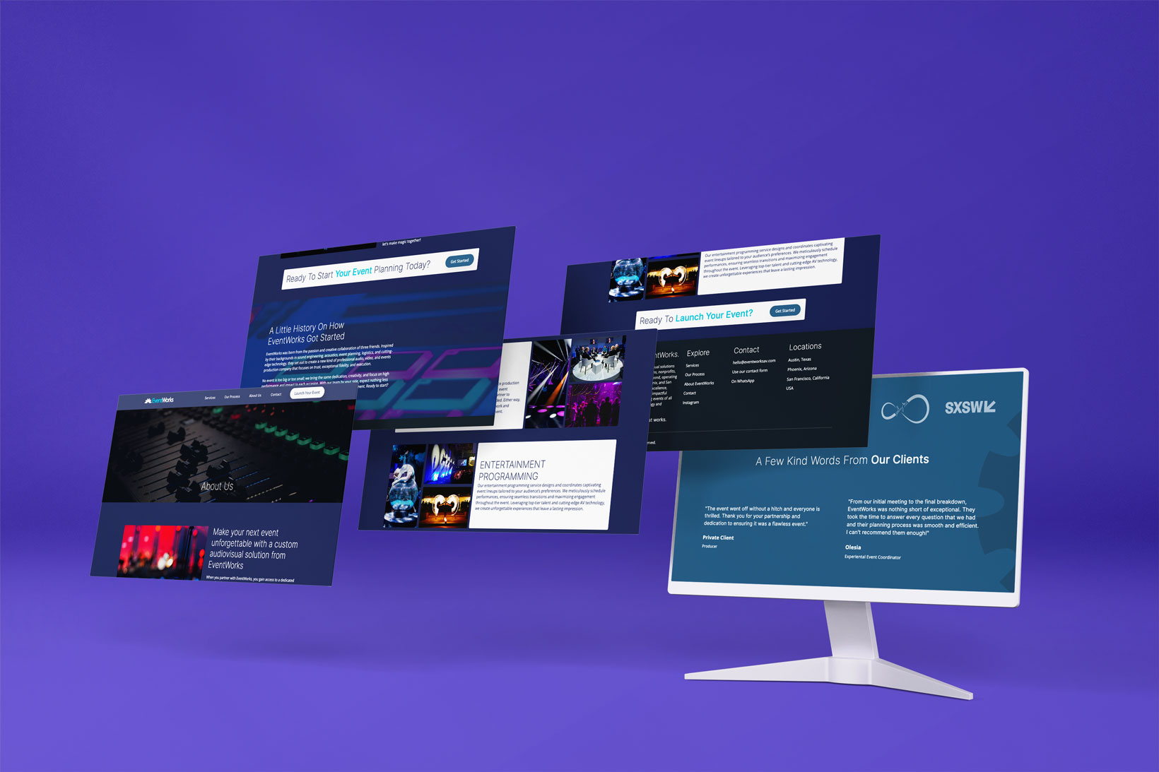
After consulting with EventWorks team, we understood the brand's core identity: clean and dark, allowing the photographs to speak for themselves. We initiated our design process in Figma, assembling the elements into a coherent narrative using the assets provided. These images played a crucial role, and our task was to integrate them into a harmonious color scheme.
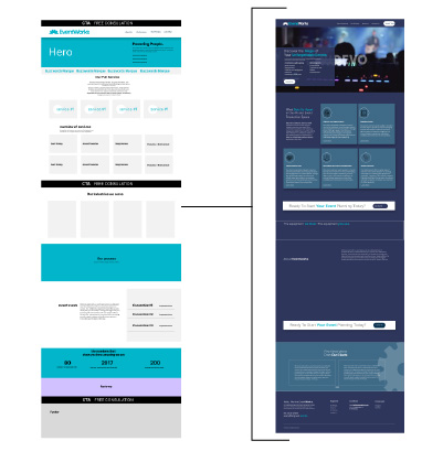
The wireframing process was smooth, but our focus needed to shift towards defining the design style and crafting a case study that maintained an optimal balance between imagery and text.
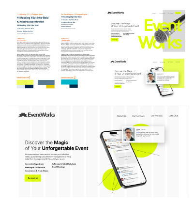
For EventWorks, we suggested moving away from paid fonts and utilizing Google Fonts due to its vast typography library, ensuring consistency and flexibility in the design.
