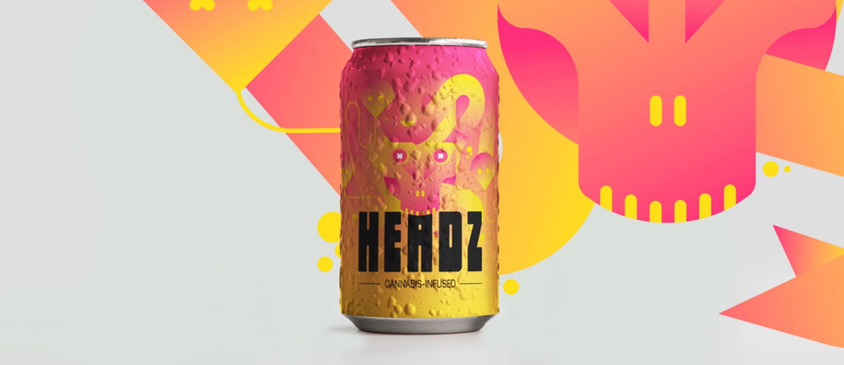
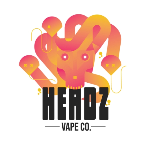
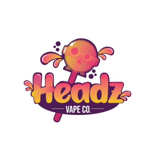
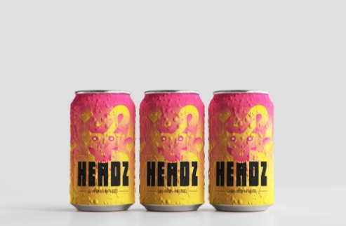
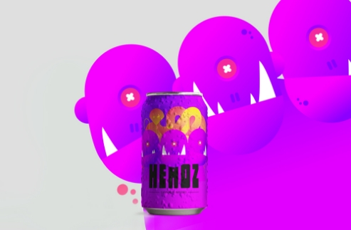
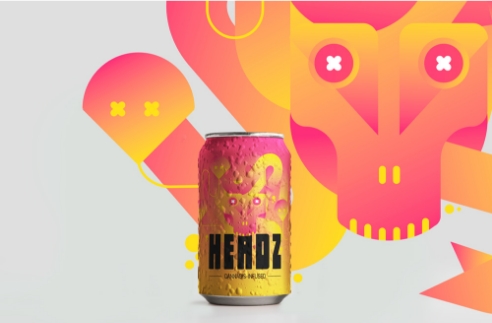
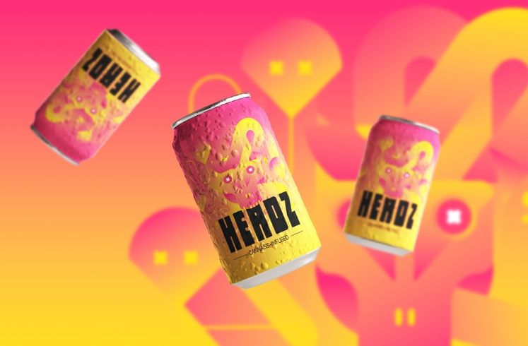
We started the development of various creatures and wanted to ensure the look and feel were similar in style across the board. The creatures could live in the same world, without there being too many styles.
The style allowed for crisp color gradients and clear imagery that doesn't rely on a deeper meaning. After all, they are creepy monster heads that are looking to party!
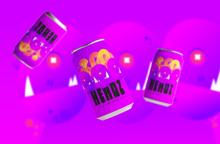
We developed the brand illustration by adding another mythical creature and a different color palette that would still match the theme of the first design. The most important pieces of the design allowed for consistent copy on a beverage can.
Finally, we could mock this up on a can and other various other products within the branding (t-shirts, hats, coozies, etc).
