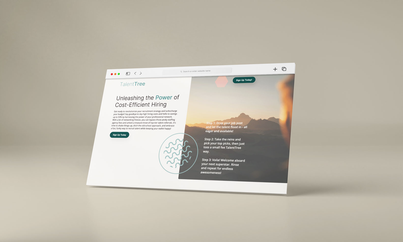
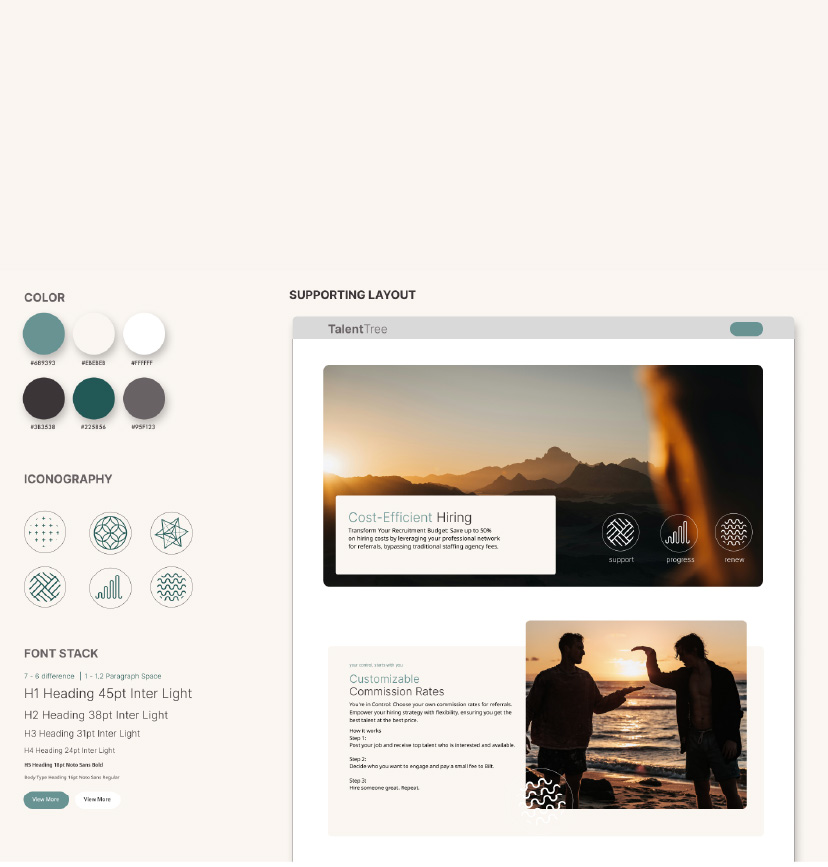
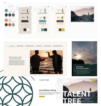
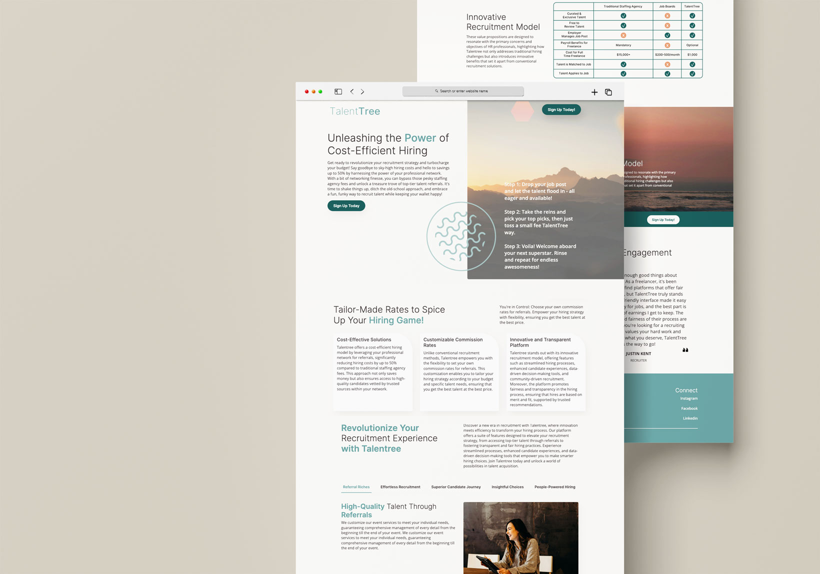
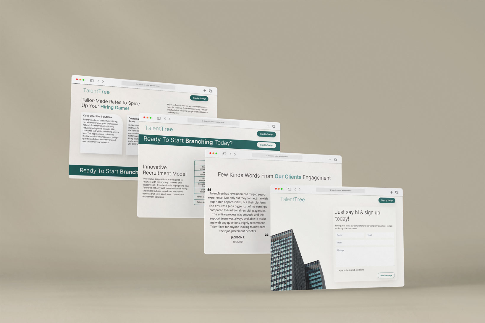
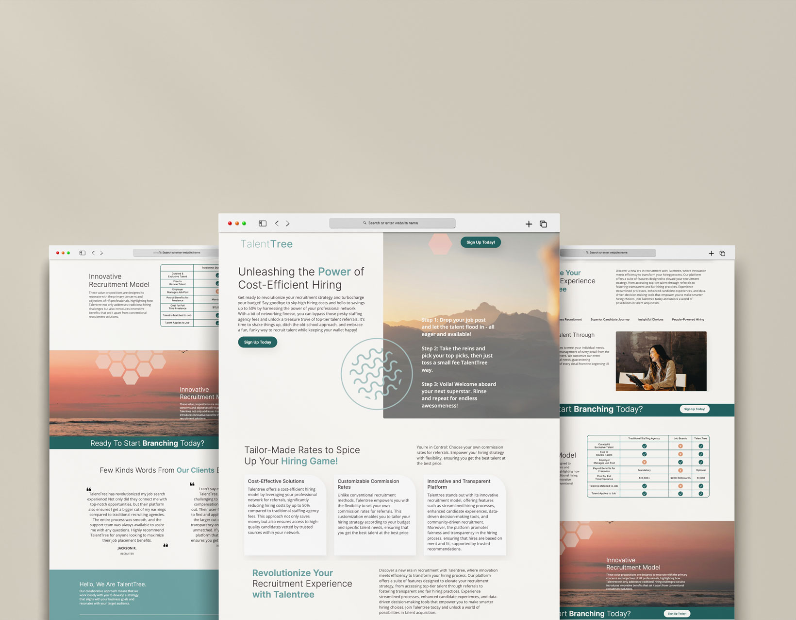
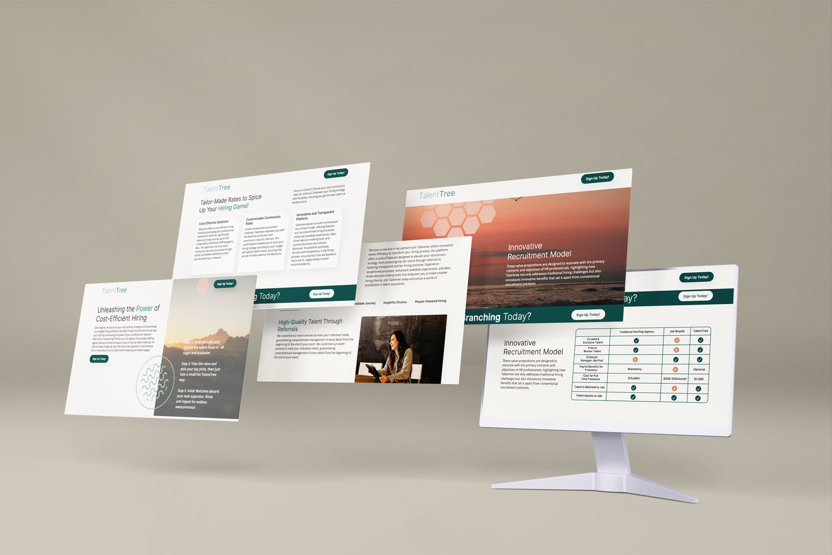
After consulting with the TalentTree team, we grasped the brand's essence: clean and dark, allowing the photographs to convey the message. We began our design process in Figma, piecing together the elements into a cohesive narrative using the assets provided. These images were pivotal, and our challenge was to integrate them seamlessly into a harmonious color palette.
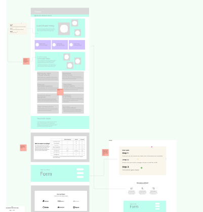
The wireframing process went smoothly, but our focus then shifted to defining the design style and developing a case study that struck an optimal balance between visuals and text.
For TalentTree, we recommended transitioning from paid fonts to Google Fonts due to its extensive typography library, ensuring consistency and flexibility in the design.
