Home » Case Studies New » Tie Breaker | Resturant

Feast Your Eyes: 
Crafting a Digital Delight

In the case study of Tie Breaker restaurant, located in Rockaway Beach, Oregon, we embarked on a transformative journey from scratch to building their online presence and brand identity. We were faced with the challenge of attracting a broader customer base, locals and tourists, and staying competitive in the ever-evolving food industry on the Oregon Coast. 

We crafted a unique website and branding package.

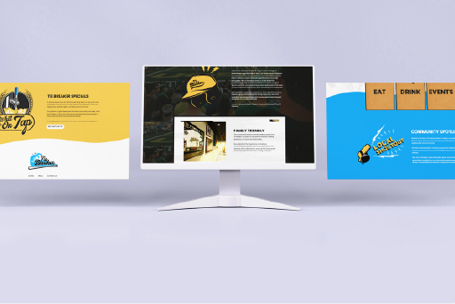
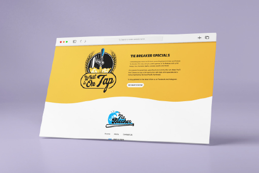
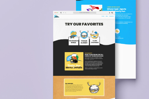
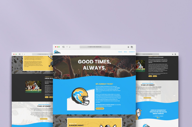
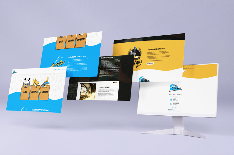
The website, with its fun and modern design and user-friendly interface, showcases Tie Breaker's menu but also provides a highlight on their involvement in the community and events.
We reimagined the branding's look and feel, capturing the essence of their sports-themed eatery while infusing it with a coastal twist - a family-friendly sports bar on the Oregon Coast. The result was a fresh and engaging. This case study exemplifies the power of strategic digital transformation and creative branding in driving success for a restaurant like Tie Breaker.
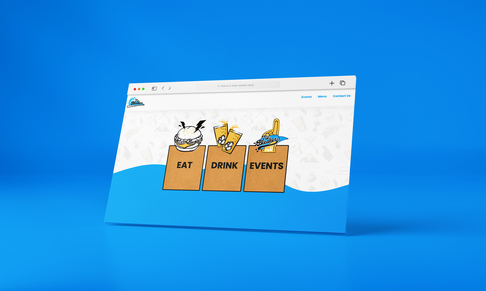
Tie Breaker

Discovery & Strategy

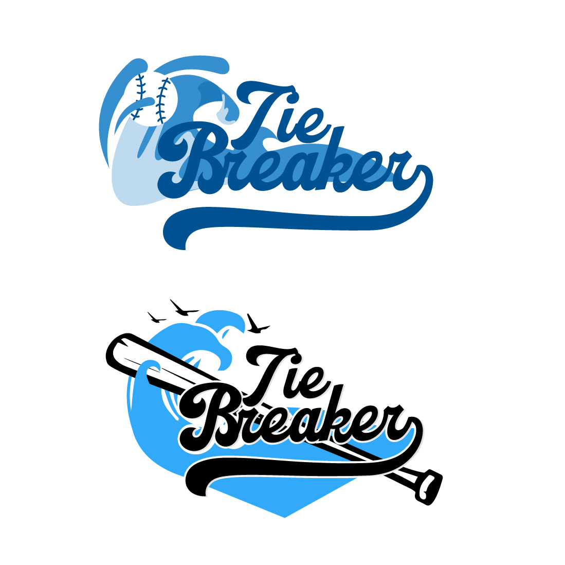
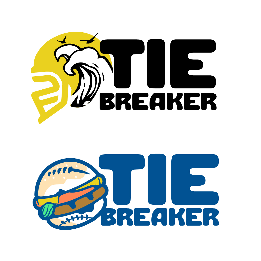
We began thinking of how we going to tackle this project with so many amazing elements to pull from. Footballs, baseballs, waves and Rockaway Beach's infamous Twin Rocks. We wanted to maintain design elements that would remain minimal and allow the images to the talking. Below you'll find early designs that speak to the nature of Tie Breaker.
Tie Breaker

Design & Exploration

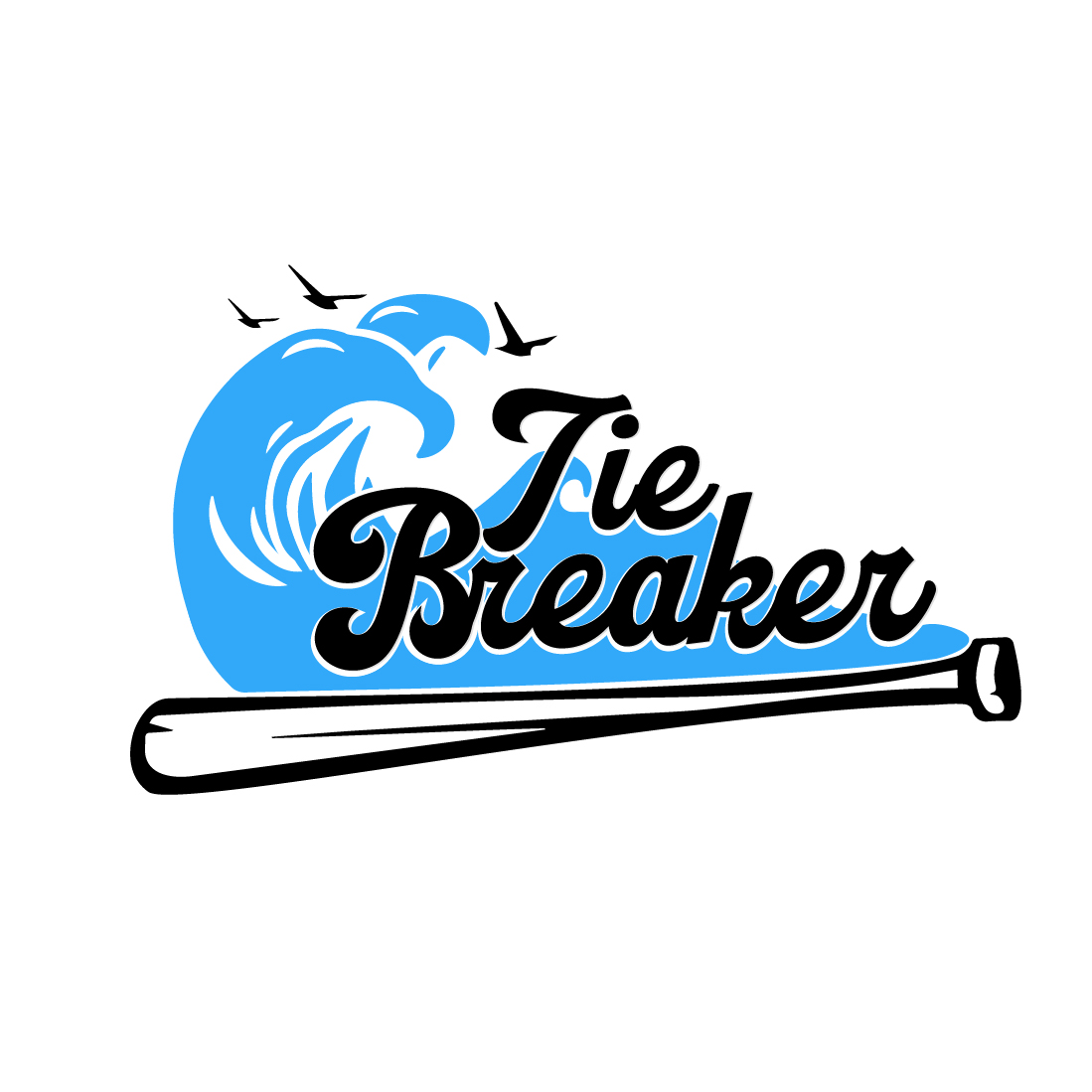
When we started the ideation process for Tie Breaker, we knew right away that blue was going to be the primary color for the brand and that we wanted to incorporate sports and coastal elements. Eventually we landed on a baseball bat and wave element.

From there the blue we selected was blended across the site with small pops of color, like yellow, as means telling the user where to click and place of exploration. After all, the goal is to keep the visitor's journey simple like the rest of the design.

Finally, the last part of the site design came down to one of the most important parts of any website design: the imagery and section layout. We decided to focus first on the individual project design with room for growth in the future. The custom elements are unique and fun, specifically made for Tie Breaker. 
Tie Breaker

Masterpiece on a Plate

The work that we created for Tie Breaker was the best type of design for a modern and fun approach. As we mentioned above, this project is something that could be easliy expanded as more building project are onboard. We're excited to watch Tie Breaker grow!