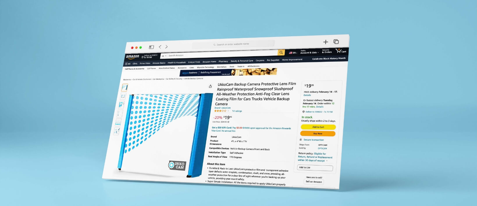
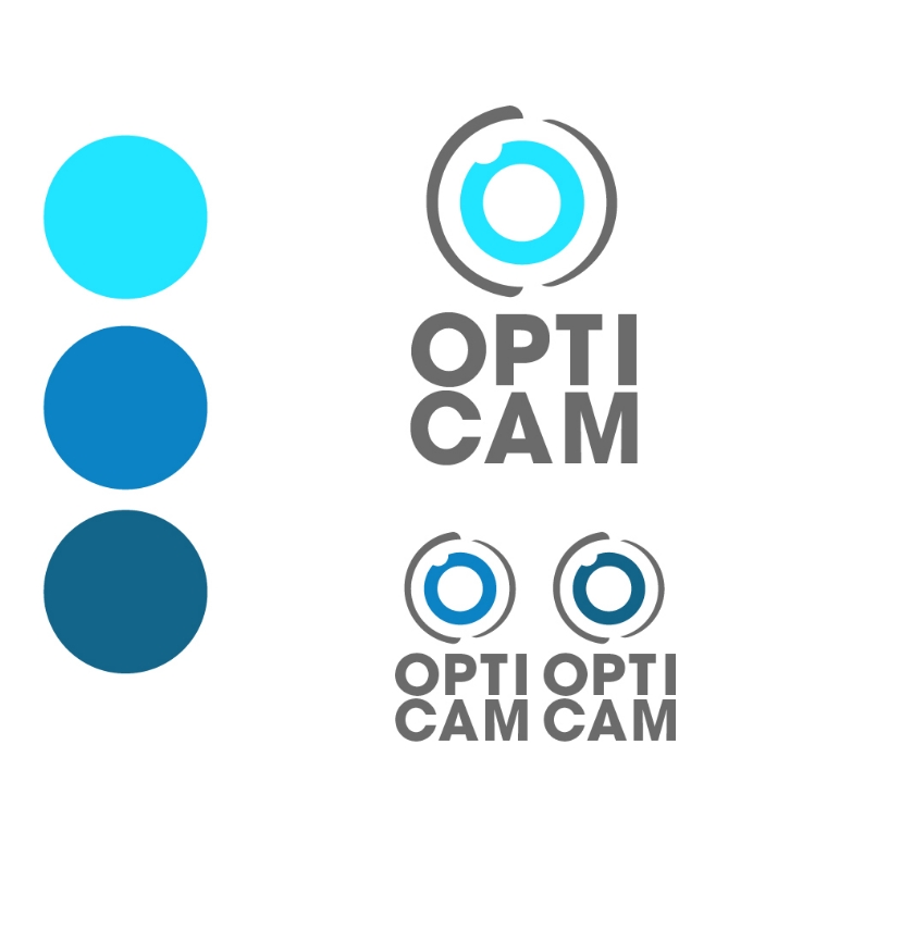
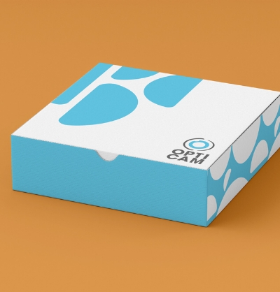
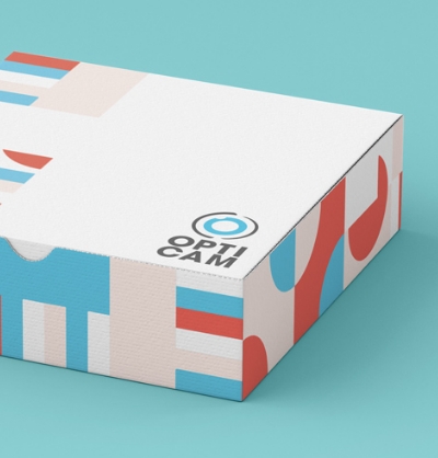
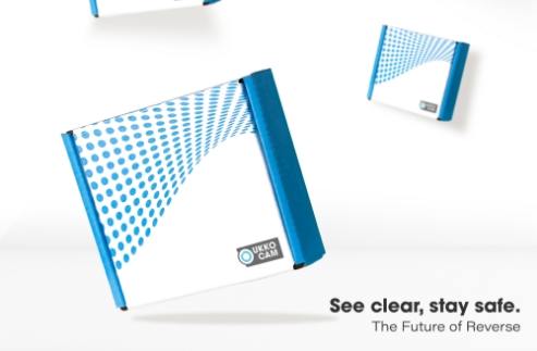
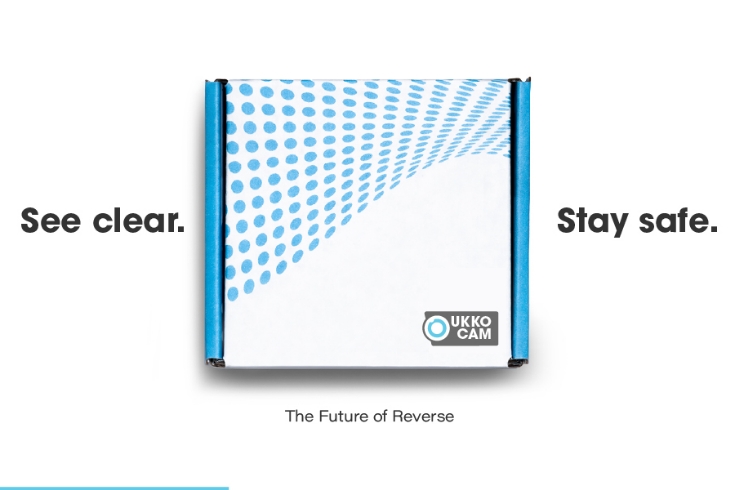
We crafted the brand by creating a logo that could fit the client's tone of a German engineer, a simple design mixed with one-tone colors.
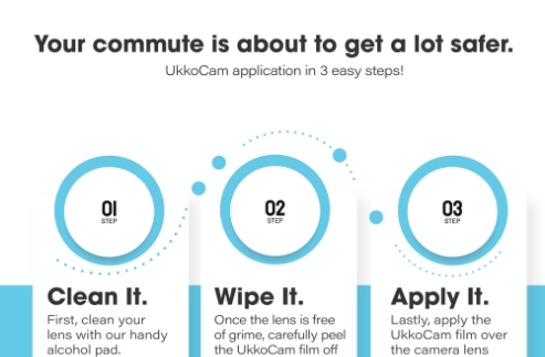
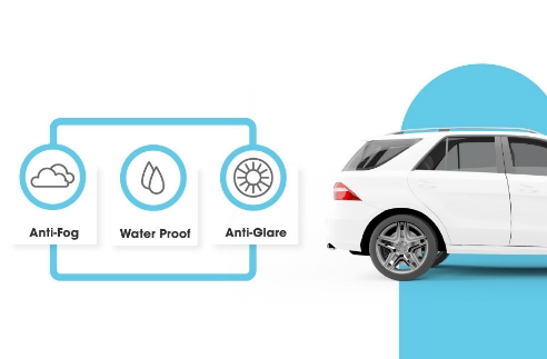
For UkkoCam, the imagery focused on the eye, since the product is known to add a protective film to the backup camera on the vehicle. During our logo exploration, we learned the words "opti cam" were being used by another company. Moving forward, we felt if we kept the words simple and similar to the letter count, it would allow for an easy replacement.
After logo creation was the brand color/brand guide. From the first onboard conversation, they were set on the color blue. A blue hue that was a call back to 1950s-1960s of modernism and automobiles.
